Blog
90for90 – Vajrasana Buddhist Centre03.22 / The Original and the Copy02.20 / The Architecture of Intuition10.19 / Up and Down09.19 / Watching Paint Dry06.19 / Gathering Light04.19 / Signs of Life03.19 / The Colour of Water05.17 / Take it as it comes01.17 / Torrential Sunshine11.16 / Where is Everybody?11.16 / Appropriate Light, Serpentine Pavilion10.16 / No Drama10.16 / Every Day is a Good Day09.16 / Sunset + 20 minutes09.16 / Appropriate Light, Turner Contemporary Margate08.16 / In Context04.16 / Fuzzy Boundaries03.16 / Is it possible to photograph the lights going on and off?07.15 / Waiting for a Solar Eclipse03.15 / In Praise of Darkness10.14 / Sensing Spaces01.14 / Nocturnal Change06.13 / The Logistics of Space05.13 /
90for90 – Vajrasana Buddhist Centre03.22 / The Original and the Copy02.20 / The Architecture of Intuition10.19 / Up and Down09.19 / Watching Paint Dry06.19 / Gathering Light04.19 / Signs of Life03.19 / The Colour of Water05.17 / Take it as it comes01.17 / Torrential Sunshine11.16 / Where is Everybody?11.16 / Appropriate Light, Serpentine Pavilion10.16 / No Drama10.16 / Every Day is a Good Day09.16 / Sunset + 20 minutes09.16 / Appropriate Light, Turner Contemporary Margate08.16 / In Context04.16 / Fuzzy Boundaries03.16 / Is it possible to photograph the lights going on and off?07.15 / Waiting for a Solar Eclipse03.15 / In Praise of Darkness10.14 / Sensing Spaces01.14 / Nocturnal Change06.13 / The Logistics of Space05.13 /

90for90 – Vajrasana Buddhist Centre 03.2022
I was recently asked to select a building as part of the Building Centre’s 90th Anniversary celebrations which brought to life a major initiative, ‘90for90’ which celebrated the last 90 years of the built environment throughout the UK. They invited 90 leading figures from across Britain – from architects, engineers, planners and developers to actors, architectural historians, photographers, broadcasters, writers and artists – to select their favourite examples of our nation’s built environment.
Each contributor was asked to select what, for them, had a special significance, and their choices create a fascinating snapshot of the built environment over the past 90 years. Their choices ranged from theatres to public houses, refurbished industrial buildings to transport hubs, iconic structures to high tech offices, a sculpture parks to a retrofitted hospital, art galleries to sporting venues. Some of the choices are world famous, others are comparatively unknown.
I chose the Vajrasana Buddhist Centre by Walters & Cohen.

I first visited the Vajrasana Buddhist Retreat Centre as a photographer. Whilst this means looking at the building closely it also means looking at it in a very specific way – looking for photographs. Surfaces, materials, forms, light and how it behaves and interacts with the materials and how this all adds up to creating an atmosphere – these are all the things that I am trying to take in. But I felt such a strong feeling of calm and serenity and a sense that time moved at a different pace here that I made a resolution to return as a visitor.

The building is beautifully designed and built. A small palette of simple materials is used to create a series of spaces made for communal living, a sangha courtyard at the centre and a strong connection/integration with the surrounding landscape. The hierarchy of materials places emphasis on the spiritual elements, living quarters are stripped back and basic but comfortable enough to not be austere. In the key spaces the use of dark brick and timber give a feel of real quality but remain modest, emphasis is on the spiritual symbols in the Stupa and Akshobhya courtyards before culminating in the imposing gold leaf buddahrupa in the shrine room.

As a place for retreat it works beautifully. The architecture functions very well but has the modesty to step aside as one’s perception changes and focus shifts inward. The building seems to dissolve allowing the natural surroundings come to the fore; I now remember it not for how it looks but for how it feels. I remember it by the warmth of the timber benches, the smoothness of polished concrete underfoot and the sense of enclosure in the courtyard with the plants gently moving in the breeze. But above all I remember it for the sense of community that it nurtures and supports.
This is architecture at its best, designed to work, built to last and enhancing the experience of the people who are there. For all of these reasons I am nominating it as my favourite building, but I also choose it to represent this type of building that can easily be overlooked – simple, quiet, without fuss, carefully considered and very well made. I hope to go back.

The Original and the Copy 02.2020
During a visit to the Louvre a few years ago I was struck by the sheer quantity of images depicting the Mona Lisa. Obviously this is one of the highlights of the collection and it will be publicised as such, but I have never seen quite the level of visibility for one individual image. I photographed a selection of signs and souvenirs as well as the actual view of the painting, which of course, ironically, is almost impossible to look at properly given its display and popularity.
Recently I read a book called ‘Flights’ by Olga Tokarczuk, one of the passages summed up this experience perfectly. Essentially paraphrasing one of the key points made by Walter Benjamin in ‘The Work of Art in the Age of Mechanical Reproduction’ which is that “The here and now of the original constitute the abstract idea of its genuineness.”
The passage is called ‘The Original and the Copy’:
“A guy in the cafeteria of this one museum said that nothing gives him such great satisfaction as being in the presence of an original art work. He also insisted that the more copies there are in the world, the greater the power of the original becomes, a power sometimes approaching the great might of a holy relic. For what is singular is significant, what with the threat of destruction hanging over it as it does. Confirmation of these words came in the form of a nearby cluster of tourists who, with fervent focus, stood worshipping a painting by Leonardo da Vinci. Just occasionally, when one of them couldn’t take it anymore, there came the clearly audible click of a camera, sounding like an ‘amen’ spoken in a new, digital language.”
Flights, Olga Tokarczuk


The Architecture of Intuition 10.2019
A single leather strap hanging from a glass door was all it took. No signage telling you to ‘pull’ or ‘push’, no decals warning you not to walk into it – despite the fact that it was a single sheet of frameless clear glass – this simple object explained it all at once and trusted you to understand.
Juhani Pallasmaa describes the door handle as being the “handshake of the building”, it is your first physical contact with it, your first impression. You can probably tell from this first moment what you are going to think of the rest of the experience, whether you are going to enjoy it or not. So whilst it was perhaps not much to go on, I think that I became an appreciator of Carlo Scarpa at the moment I got to the entrance of Palazzo Abatellis; everything else in the museum only served to reinforce this.
This entrance, which allowed the visitor to intuitively find their way without being told (or at least feel like that was the case) was the perfect introduction to the galleries. Here too we are confronted with the minimum of fuss, objects stripped bare of frames and display cases are presented with minimal text – title/artist. The weight of history is lifted and we confront the art face to face, directly, in the present moment.


What this does is enables us to have clear vision. We can take in the objects for what they are (rather than what someone tells us they are) and imagine the hand of the maker at work rather than that of the curator, the connection with the objects is an emotional one rather than an intellectual one. In short, we can see.

There are some wonderful moments of presentation where objects are framed by the architecture from specific viewpoints, places you have just come from or will go next. This guides you through the space in a gentle way, intuitively. Fresco coloured wall panels create backdrops against which sculptures can be seen, carefully positioned so that the light from an adjacent window will fall on it in just the right way but free within the space allowing you to decide where to stand.
Frameless paintings are mounted on hinged metal brackets elevating them from the wall slightly and reinforcing their presence as objects rather than pictures. This also gives the impression that they could be turned round in order to view the back of the panels and discover more about them and how they were made.

It is also a very democratic way of presenting, the most valuable and the most humble are given value and allowed to be seen as equals. All the while the architecture of the palazzo provides the backdrop, the true framing device for the viewing of the collection. It is a refreshing way to see a museum collection, and very fresh too despite being completed in the mid 1950’s.

Carlo Scarpa’s design seems to manage to be both very direct and very subtle at the same time, my description and pictures may make it seem like it dominated the actual exhibits but far from it, it set up the perfect environment in which to view them and it is the best example of exhibition design I have seen.

Up and Down 09.2019
I knew that this scene reminded me of something the instant I saw it. We were at the Archabbey Pannonhalma in Hungary to photograph the new lighting installation by Speirs+Major which had been developed alongside an architectural refurbishment by John Pawson. The lighting was being focussed at this stage, final adjustments being made and I was waiting for the go ahead to photograph. I had to be quick, I didn’t have time to change the lens but I liked the picture that resulted.

Last month at the Rijksmuseum in Amsterdam I saw the painting ‘Iconaclism in a Church’ by Dirck van Delen (1630) and realised agin what it was that I had half remembered, this was the picture that I had seen somewhere before. The painting shows a church in August 1566 where Protestants are tearing down a statue from its plinth, countless statues and alterpieces were destroyed in churches throughout the Netherlands, a scene rarely depicted in dutch art.
At Pannonhalma it is a scene of restoration and illumination, the opposite in many ways and it makes a nice echo from the painting.

Watching Paint Dry 06.2019
Taking the opportunity presented by an empty room with one window facing east I photographed a series of variations in colour temperature taken across the course of a day. The variety of colour is astonishing and is a good example of why I like to paint interiors white*, the light entering a space has infinite variety and more colours than I know how to name. Even in subtle light conditions colour comes from light, not paint.

(*since taking these pictures this room has been redecorated with a fresh covering of white emulsion)

Gathering Light 04.2019

These images are from Fortnum & Mason at The Royal Exchange in the City of London. Photographed recently for Speirs + Major with a focus on the change in atmosphere from day to night as the bar and seating areas become more intimate and cosy within the centre of what is a very large atrium space. Talking with the client, I was struck by her description of how the lighting created a strong sense of enclosure whilst sitting at the bar, despite the fact that it was completely open, without either walls or roof.
This came to mind immediately upon reading a quote by the Danish architect Steen Eiler Rasmussen, “a campfire on a dark night forms a cave of light, circumscribed by a wall of darkness. Those who are within the circle of light have a secure feeling of being together in the same room.” A ‘room’ generated by light alone, going back to the most basic idea of gathering around the campfire at night.
Here we have the same concept, as the bar becomes the fire at the centre creating a point around which to gather and a creating warm sense of enclosure. This ancient concept which will surely become relevant again as we are required to consider light (energy) as a limited resource, a commodity, to be used sparingly and carefully.


Signs of Life 03.2019
Architecture in use (in photography speak) means having people in the pictures. I try to include people when possible but I am still guilty of doing this ‘within reason’, it has to be the right people in the right place for the photograph, people tidied up. The space is also usually tidied up, clean, new and presented in its best state for the photographs. Is this just the appearance of buildings in use?
What about the results of this use? Mess, wear and tear, the input of occupants rather than the design team. Should we, as photographers, show more of this? The results of a ‘building in use’ may not be suitable for project photography on first glance, but they are the result of the project in action. A building has a function and people fulfil this functionality through use. Wear and tear is visual evidence of a project ‘working’ and fulfilling its purpose – is this not evidence of its success?
I have been thinking about empathy and how to communicate this through photography. Having people in the photographs is not the same as enabling the viewers to put themselves into the photographs, illustrating something ‘in use’ is not the same as enabling someone to imagine themselves being there. Memories and emotions have to be triggered in order for the viewer to relate to what they are looking at, signs of life acquired through previous use/occupation could be ways of jogging these memories.
The film director Andrei Tarkovsky, when talking about his use of dilapidated buildings in his films, suggests that “we tend to project our feelings of empathy and compassion on scenes of damage and erosion, whereas perfected structures do not call for, or need, our sympathies as they present themselves self-sufficiently through their rational and instrumental values.” This also sounds like an analogy for the comparison of photographs and CGIs, the visual triggers that bring a photograph to life and make them more than illustrations are the imperfections, the flaws, the human elements. Humans placed in a photograph might actually add to the visual perfection of a scene, they are visible but they leave no trace. Humans using a space will leave evidence and thereby show more about the function of the building unintentionally than any level of staging ever could. So next time I am about to tidy up for a photograph I will try to think about what I might be about to miss.


The Colour of Water 05.2017
“The light of Venice is as important as its space and form. The light on water casts illumination upwards and outwards…..There is a sparkling light, on winter days. But the characteristic of Venice is a pale soft light, like a drifting haze, powdered, part wave and part cloud. It is a pearly iridescent light wreathed in mist. It is drawn from the horizon as much as from the sun. It lends everything unity.” Peter Ackroyd, Venice
The light on the venetian lagoon is hard to describe, it has to be experienced. During a recent visit to Venice I made regular trips on the vaporetto out to the islands of Mazzorbo, Torcello and Sant Erasmo. These islands are all a little further out in the lagoon, all places near to Venice yet far removed. Over time the lagoon became a destination in itself.
Something about the stillness of the water and the way it reflects light from its glassy surface. Something about the hazy wintery conditions that hide the horizon from view, sky and water blending together, indistinct. Something about the softness of the colours, subtle yet vividly there.

This is light as physical substance, you don’t just see it, you feel it. You are ‘in’ it. Endlessly changing, endlessly watchable. The effect of the movement of the water combined with the movement of the boat has a mesmerising effect, it becomes soporific, hypnotic almost. Time moves at its own speed here, like another substance, indistinct and unimportant it passes as we move through it. I have noticed that when out on deck looking into the lagoon people often end up with their eyes closed, maybe the effect can be better felt this way as though what the eyes transmit is too literal.
“What in any case is the colour of water?” (Peter Ackroyd, Venice). “The colours of the sea approaching Venice have variously been described a jade green, lilac, pale blue, brown, smoky pink, lavender, violet, heliotrope, dove grey. After a storm the colour changes as the water becomes aerated. On a hot afternoon the waters may seem orange. The colours of the sky, the colours of the city, are refracted in little ovals of ochre and blue. It is all colours and no colour. It reflects, and does not own, colour. It becomes what it beholds.”

Take it as it comes 01.2017
As described in a previous post about people in photographs (“Where is Everybody?”) I often spend time directing people or waiting for passers by to ‘be in the right place’ for a picture. Whilst there are good reasons for doing this it does beg the question ‘what is the wrong place?’.
Users of the space enliven the photograph and sometimes assist in illustrating scale and use. By placing them carefully within the frame they become a considered part of the overall composition. The flip side of this is that if they are not carefully placed within the frame then they will be upsetting the composition, as though people can be in the way, or somehow spoiling the picture.
Recently I have been playing with this idea and trying to just take it as it comes. So, rather than trying to create the perfect arrangement in order to show the activity I can just show the activity. No-one is in the wrong place, they are just in place.
Other people want to look at and photograph the building too, are they ‘in the way?’ or do they in fact illustrate one of the building’s functions, that of ‘attraction’, or ‘destination’ for visitors to the city. By being there myself as a photographer I have become a part of this activity, am I in the way? Am I in someone else’s photograph?

Activity as part of the scene: rather than try to capture ‘perfection’, or my idea of what the project ‘should’ look like why not capture what it happens to look like at that particular moment? Everything can be included, everything is relevant. Rather than wait for everything to change and fit my photograph I should ask myself ‘am I in the right place to show everything?’ Activity as part of the seen.
Taking it as it comes may end up revealing more about the place than a carefully set up image would. For example, a photograph of the exterior of the Kunstmuseum Basel with a car going past obscures the view, but then the building is located next to a busy road and there is usually a car (or a tram) going past so this is a typical view from that location, cars are a part of the view. The road needs to be crossed in order to reach the Museum.
Things that could be considered mistakes may in fact result in more interesting images, more unexpected images. The viewer may learn more about the building through less choreographed images. (I am also hoping that the photographer may learn more about how to photograph buildings!)

In future I will try to make more mistakes, try to take it as it comes……see what happens.

Torrential Sunshine 11.2016
I enjoyed a recent visit to the Portland Collection in Welbeck, Nottinghamshire (Hugh Broughton Architects) to photograph on behalf of lighting designers Speirs+Major, it is a wonderful project which received a RIBA National Award earlier this year. I arrived in torrential rain with little hope for any exterior views at all, however, the storm blew over quickly and we had a brief moment of low bright sunshine when the light flooded into the Entrance Pavilion.
The full set of images showing the lighting design will be published soon, but in the meantime, sunlight and shadow.


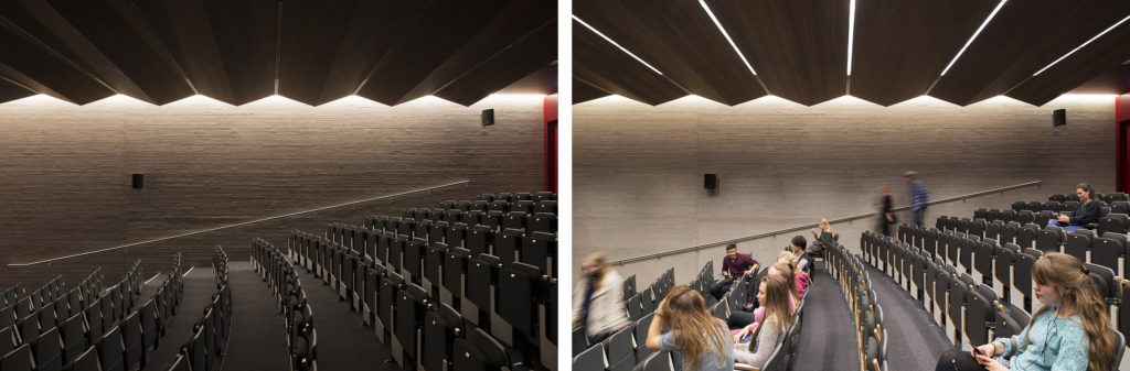
Where is Everybody? 11.2016
Increasingly the emphasis of project photography, be it for lighting or architecture, is on people. Documenting people in the space, their activity, the visitor experience. People are the reason architecture and lighting are designed, they are both creators and end users. This means including (where possible) people in photographs and these are some of the considerations I take into account when doing this.
(a large amount of credit at this point must go to Speirs+Major for not so much suggesting as insisting that my photographs include people.)

July 2016
Where are they?
As soon as a person enters the frame they become a, if not the strong element within the picture. Immediately the eye is drawn to the figure – so position them carefully within the frame and make sure that the eye is drawn to something revealing. The Serpentine Pavilion project has many good points, but one I particularly enjoy is the level of interaction it encourages between visitor and architecture, it is very direct and playful and leaves me thinking we should interact with architecture more often.

Where should they be?
If the image is of an empty space then the sole focus is on architecture – in this instance the specific focus is a lit wall at the rear of the space.
![]()
Once a person enters the frame there is immediately another focal point. In this example the figure brings a sense of movement to the scene as well as demonstrating the scale of the space. Perhaps more importantly they also provide a silhouette against the rear wall thereby enhancing the lit effect that is being illustrated.

Also drawing the eye will be the brightest elements in the frame, in this instance the red lobby in the background is very strong so perhaps the person should be dressed in red to balance that out? Where exactly within the frame should they appear in order to create that balance? Maybe they should be here, or here, or here…….

What are they doing?
As well as drawing the eye people can help to illustrate the use of space and explain what it is there for. Whether it is an exhibition stand set up in order to demonstrate lighting equipment or a workstation in a shoe shop, by showing people carrying out specific activities it is possible to add to the amount of information provided by an image.


How many are there?
What kind of space is it? What is its function? How many people would usually be there? Once full of people the atmosphere of the space is completely altered. It becomes full of life and energy, movement, interaction and of course sound – a subject I will look into more in another post.
Where are they going?
In the image below the suggestion of movement up the staircase serves to enhance the flowing lines and curves of the staircase design whilst at the same time providing a nice contrast with static nature of structure. I usually like to show people moving or blurred, – not only does it show that they are alive(!), but also it slightly reduces the focus on them, you are not wondering about who they are and whether you recognise them or not, it is more generic and keeps the focus on the architecture whilst enlivening the picture.

What are the wearing?
Is this just a coincidence? I find this happens a lot, people will be dressed to match their surroundings (no, really) especially at art exhibitions, it might be just my imagination, but I like to think it is some sort of subconscious decision, we are drawn to the things we like……..

Don’t look at the camera!
You have seen them, but have they seen you? Most people will ignore the camera, some will get out of the way and avoid being photographed, abut then there are always those that want to get involved…………….OK move along now please.


Appropriate Light, Serpentine Pavilion 10.2016
Sometimes it is good to try something different. This post focuses on the Serpentine Pavilion from 2015 by Selgascano where I got to try out some ideas and approaches to architectural photography that I hoped would show the key aspects of the project from a different perspective.
I liked this Serpentine Pavilion, I thought it was in the spirit of the project (it is after all a temporary structure). It was playful, experimental, immersive & joyful; it was also full of colour. It is so nice to see some colour in architecture (all too rare in London) and some materials that reacted to the sun and brought the sunlight inside – making it a part of the building. The heat came in too, wow it was hot in there, but from what I saw people really interacted with and enjoyed the building. Kids absolutely loved it, literally jumping for joy when they went in and it is rare for architecture to cause this reaction. It was a reaction caused largely by the use of colour and light.
The architect described the pavilion as follows – “We sought a way to allow the public to experience architecture through simple elements: structure, light, transparency, shadows, lightness, form, sensitivity, change, surprise, colour and materials. We have therefore designed a Pavilion which incorporates all of these elements.”

Sunlight passing through coloured dichroic film is projected onto the white floor – the movements of the sun are tracked across the pavilion floor during day creating layers of shadows, colour, material and light – an immersive experience.
Large areas of the pavilion’s skin were made out of coloured dichroic film. As well as allowing coloured light to come in this material could be looked through, creating coloured views of the interior space.

Selgascano work using simple everyday materials (as found) often in an experimental fashion, here a combination of dichroic film, coloured ribbons and ETFE are stretched across a steel structure to create a series of interconnected organic ‘pods’.
In experiential terms the architects explain“The spatial qualities of the Pavilion only unfold when accessing the structure and being immersed within it.” So the next step was to take a similar approach to the photographs as well. By trying to be playful, experimental, immersive and joyful, I have also tried to create the feeling of “being immersed within” the pavilion.
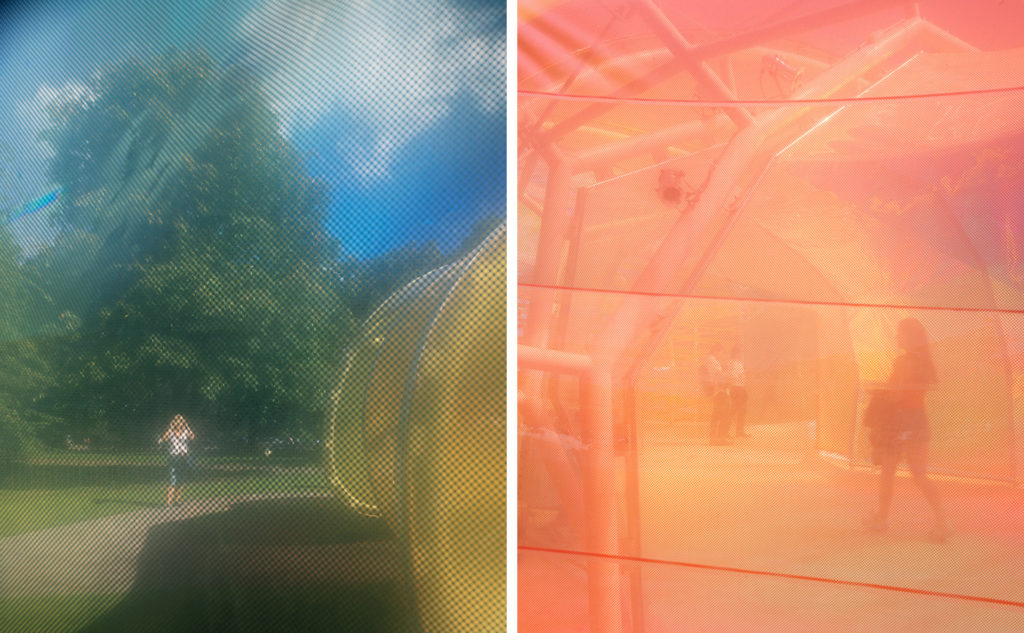
As well as using views directly through the pavilion’s various skins I also made a series of views through filters that I constructed out of the same dichroic film that was used to cover the structure. By using a combination of filtration and reflection in front of the camera I was able to play with the ideas of layering and immersion within the photographic process.

As the Serpentine says: The architects’ inspiration not only came from the site itself, but from the ways in which people move through London, notably the Underground with its many-layered, chaotic yet structured flow. By using reflections and views through materials I played with these ideas of layering and flow. There is also a short video that plays with this idea further.

I wanted to respond directly to the project in a way that I felt was in keeping with its spirit. The images may or may not be judged ‘successful’ in terms of illustrating the concept, but the point was to be experimental and not be so concerned with the outcome. Afterall, what other project is going to allow me to do this?

No Drama 10.2016
All too often photographs of architecture intend to make you say ‘wow! look at that’. They grab your attention, attempting to pull you away from the flow of imagery to which we are now exposed and into a website or magazine article. ‘Wow’, we say – then move on to the next one, ‘wow! look at that’ – next, ‘wow! look at that’ – next, and so on. But what if there is no ‘wow’ factor? what are we left with.
Well, ‘look at that’ to be literal about it. The difference being that rather than demanding your attention a picture can simply offer itself up to be looked at, perhaps more slowly, perhaps for longer.
Sometimes a project has no drama. This doesn’t mean that the project is no good or lacking in some way, rather it is quieter, with a quality of stillness. Perhaps it has more to do with architecture as background condition, a space to be lived in rather than shown off, to be experienced and not just seen.
I have recently been fortunate enough to photograph two projects for Robin Lee Architecture – 71 Queensway and the Old Paint Factory – and it struck me that this was just such work. In each case a former industrial building has been refurbished as living space, in each case the starting point was a fairly ordinary structure and the end result is unspectacular. Again, I do not mean this in a negative way, how many of us live in a ‘spectacular’ house, or indeed want to. Spectacular view or location maybe, but house? Give me quiet simplicity any day.

Whilst some of the materials used may be luxurious, they blend in with the whole. Where original features are left exposed, even raw in places, they speak of what remains of the original rather than leaping out as a feature of urban chic. This is simply the way it is, this is the way the place is made. Colours are muted and subtle, elements provide function rather than feature and the overall effect is one of calm which provides a welcome contrast to the city outside the doors.
As Mary Duggan writes in an article about 71 Queensway in AJ ‘This project is about creating a specific atmosphere rather than a specific appearance’.

I think I am drawn to these projects because it fits with the way in which I like to photograph architecture (and places in general). Where possible I aim to just show what is there and try not to create drama within the pictures. Quiet pictures for quiet architecture.

Many factors contribute to the experience of architecture, all senses are active. A photograph, on the other hand, will only ever be a visual representation, an appearance. But a photograph can suggest as well as show. Composition and activity within the image can provide clues as to what it might sound like within a space. Light conditions can be used to create a specific atmosphere. Focus on materials and the way that they respond to light will offer information as to the texture and feel of the surfaces, what temperature they might be if you touched them, whether they are hard of soft. This in turn will provide further information about what the space sounds like and so on.

In the end the pictures are not so different. But there can be a subtle shift in focus away from the surface of the photograph towards the quality of the space depicted. A shift away from a purely visual response toward a more imaginative one. Wow factor can grab your attention, but can it show you what a place is like? Can you see beyond the photograph?

Every Day is a Good Day 09.2016
When is the best time to take a photograph? In what light should the building be seen? Should it be seen in its ‘best light’? If so, what is this light and more pertinently, what is it best for? Best for showing off the building, or for showing off the photograph, or for showing something else?
The first image in the set below shows The Turner Contemporary Margate on a sunny day, blue sky sunlight coming from the ‘right’ direction would be a typical approach to photographing a building. But what if the weather is not like that in Margate, should the building still be photographed? Sunlight and blue sky show us one thing, one condition, other conditions will reveal other things.

What should a photograph show? What aspect of the building will it explain and how will the light help to explain it? In the below photograph we can see how the sunlight is ‘bringing out’ the colour of the cast concrete facade. But then overcast conditions will ‘bring out’ another shade, rain will soak the concrete and the appearance of the building will shift again.

Grey concrete can appear blue, golden, pink or aubergine in endless variation. This can happen minute by minute changes as the below image sequence shows. So which one do we show? Which is best? Or do we need all of them to make the point that far from being harsh, dull, grey or blank a concrete building can actually respond with subtlety and a whole range of colours and effects to the ambient light conditions. What colour is this building actually?

Taking this further means looking for longer; hours not minutes. How will a building’s appearance change over the course of a day? What is the day to night transition and what can this tell us about the materials, the location, the building’s function?

Of course some things only become visible at night.

Assuming that the project is there all year round would it be of interest to photograph it all year round as well? Even the simple act of uplighting a tree will illustrate seasonal variation. Expand this across a whole area of landscaping and the effect will be fundamental to the feel of the space. Added to this is how the use of the space will change across the seasons, how many people will be using the space, how long will they stay there. The very function of a space may change depending upon the time of year.

As they will tell you in the Lake District, there is no such thing as bad weather, just inappropriate clothing. So similarly when it comes to photography, there is no such thing as bad light, just inappropriate looking. Nichi nichi kore konichi (Every day is a good day) or, all days are equal. All light conditions are equal, equal in that they are there to be seen, equal in that they can show us something, so it is not a question of how something should be seen, but of how we are looking.


Sunset + 20 minutes 09.2016
There is a point on a clear evening with a crisp blue sky when everything seems to be in harmony. Calm and serene yet vibrant at the same time, an electric atmosphere hangs in the air for a short period, a merging of darkness and light. The lighting on the buildings is seen in balance against the remaining blue light of the sky and the city seems especially alive. This is why I enjoy dusk; photographing lighting projects is why I spend a lot of time waiting for it!
If I google ‘dusk’ it says 6:57 PM Friday, October 7, 2016 (BST), Dusk in London, UK. All very precise, according to this dusk will be happening 33 minutes after sunset. Wikipedia then tells me that Dusk is actually short for ‘Astronomical Dusk’, or the darkest part of twilight before night begins. This is part of a whole sequence of events that lead from day into night – sunset, civil twilight, civil dusk, nautical twilight, nautical dusk, astronomical twilight and then astronomical dusk all occur before ‘nightfall’. Time measured against the course of the sun.
Minute changes in light level, angle of sun and colour of sky are what we will see as this process unfolds, this is one of the times where we can most vividly experience the minute by minute changes occurring around us. Flux in action – visible.
The following images (Lower Regent Street, lighting by Studio-29) illustrate an exercise in recording and viewing these changes, the first image at sunset followed by an image every 5 minutes. When seen together they allow us to observe the balance shifting within the scene; the sky darkens and the emphasis drops onto illuminated windows, traffic on the street and building facade lighting. As one aspect of the city dissolves another appears.


My rule of thumb for project photography is sunset +20 minutes, this is usually the time I can start taking the photographs. Pre-planning will allow me to have mentally ‘set up’ a number of images and then it is a race against time to try to get them all done during dusk.
All of this will depend upon the project, the local environment, the level of artificial light, the amount of sky that is visible in the image, the weather, cloud cover and what is happening at the location. So there are many factors that will help me to decide when I am going to take the photographs but ultimately it just feels right at the time.

Appropriate Light, Turner Contemporary Margate 08.2016
JMW Turner – “…the skies over Thanet are the loveliest in all Europe”
I have always loved looking at Turner’s paintings, especially the later or ‘unfinished’ ones. For my taste, the more abstract the better, less distinct or descriptive means more atmospheric and ephemeral. But I did always take them to include a large dose of artistic licence. A ‘nice interpretation’ I would think, but of course in reality it was not like this, not as intense as this…….
The first time I visited the Turner Contemporary Margate to photograph it I waited for a sunny day. Beach/seaside/sunshine. Strong light and shadow for strong building form. Simple yes, but effective? On a second visit at a later date, this time not to photograph, I experienced sunset at the end of a long clear evening. Watching the sun setting across an expanse of sea I became aware that this was ‘one of those places’ where there is something special about the quality of light. Cleaner somehow, colours more vibrant, effects more intense. Porthmoor Beach at St Ives is another such place and whilst it is a cliche it is true. The sunset looked like a Turner (cliche time again), it did not just remind me of his paintings, but it actually resembled one.
The next time I visited it was because the weather forecast was for fog. Fog in combination with that light could be interesting! When I arrived what I saw was, well fog. Thick thick fog which meant that I could not actually see the building that I had come to photograph until I was almost at the entrance steps.

Spending time out on the beach it was possible to lose orientation and forget which direction was the town and which was the sea. Sounds were muffled and yet amplified at the same time and the effect was, in its own way, wonderful. But I could not see the building to photograph it. I must have arrived mid morning and it was not until 4pm that the fog started to clear. Gradually views of the gallery emerged, glinting in the sun through the fog.

The sun was low by this point, being winter sunset was not far off, so colours were beginning to appear. The fog took the colours and the light as it shifted and dissolved slowly, new glimpses of views would emerge and disappear, strong moments of sunlight on buildings and then glimpses of blue sky. The effect was not just wonderful but extraordinary as I found myself standing in a Turner painting. Abstract and indistinct with no sense of perspective or direction, just an emersion in colour and light. So I realised that it was not artist licence after all, this is it!

Once the sun appeared the fog melted away quickly, lifting and rolling out to sea like the tide going out. We were all left with a clear and crisp evening sunset and a sense of astonishment. It was one of the most spectacular light effects I have experienced. This winter when the weather is getting cold and foggy, cast your eye to the forecast for Margate.
Of course I took some pictures, but I’m afraid I am no Turner.


In Context 04.2016
The location of a building is one of the factors that will have the greatest impact upon its design. The existing conditions, local history, culture and climate will all impact by providing cues and boundaries in the design process thereby playing a large part in decisions on orientation, scale, form and materials. Once complete the building then has an impact of its own upon the surroundings as part of an ongoing relationship. Is it complimentary or intrusive, sympathetic with or in contrast to its neighbours, has it improved the situation?
How photographs can show this relationship is something I have been thinking about recently and I have a dedicated section on my website to showing buildings in context. Within these images several key themes emerge which can be considered when photographing architecture.
1 – Activity


The Jerwood Gallery Hastings is a lovely building for many reasons, but I think a major factor is how sympathetic it is with its surroundings. Its location is an area called ‘The Stade’ which is a launch/landing area for fishing boats, simple huts and ‘Net Shops’ (tall black wooden sheds) are the local vernacular and illustrate how to make best use of limited space. In terms of ‘use’ this is a building that is out of place, an art gallery amongst fishing huts (congratulations to HAT Projects for taking this on let alone succeeding!) So the fact that the building sits quietly amongst its humble neighbours shows sensitivity to activity – fishing – an activity that has been taking place on the site for hundreds of years. The new building honours and respects this through its scale, form and materials (the black ceramic tiles are especially good) and the best ‘views’ are those looking out from the galleries towards the surroundings, not those looking back towards the building.
2 – Viewpoint (taking a step back)

Swindon Triangle is described by architects Glenn Howells as ‘a contemporary and sustainable re-interpretation of Swindon’s 19th century railway town vernacular’. There is a wonderful ordinariness to it, simple well designed housing for people to live in. The site is set up to encourage a sense of community amongst the residents, but it is the views from outside that show the integration with the existing houses in terms of scale, roof form and particularly colour. Ordinary housing requires ordinary everyday viewpoints. At first glance these might suggest that the project is not shown clearly, but actually they can clearly show a fundamental design element.
3 – Proportion (less is more)

How much (or how little) of a building needs to be in the photograph? In the case of ‘Signal Box’ in Basel by Herzog & de Meuron I had a go at ‘how little’. By focusing on the surroundings as much as/more than the building itself it is possible to illustrate what the building is for (operating train signals), why the building looks like it does (functional/industrial location), form and material choices (taking cues from the railway lines) and scale (elevated viewpoint across lines). Another signal box (no.4) is also visible in the distance showing that this is not a stand alone building, but one of two or one of many. Indeed the architect explains that ‘now completed, Signal Box 4 has been so well optimized that it has become a prototype that can be erected, like a standardized structure, in all the urban regions of Switzerland. The use of such a similar structure throughout Switzerland would dovetail with a vision of the country as one single urban landscape.’ So showing less of the building can indeed show more (about it).
4 – Light
How can light show context? I often consider light, or the question ‘what is appropriate light’ for photographing a project (which is another post in itself) and the following images make this point very simply. They include one project that compliments its surroundings and one that stands out by contrast.

Hepworth Wakefield by David Chipperfield Architects is located in an industrial waterfront area and references surrounding warehouse style concrete buildings. Flat uniform light shows subject and surroundings in the same light and helps to show both together rather than separately. I deliberately chose to visit on an overcast day both to illustrate this point and the fact that being in Wakefield in the North of England this weather would be a more typical example of place.
Central St Giles in London by Renzo Piano Building Workshop on the other hand stands out from its surroundings by using a vibrant series of colours on the facades, not very London I’m sure you will agree! Although the architect’s website states that this ‘fits well with its urban context’ by responding to its surroundings it seems to me to ‘contrast well with its urban context’, a point that was emphasised by dramatic sunlight in the above image. By waiting for just the right moment when sunlight was falling on the orange facade and not on the foreground or adjacent buildings it was possible to show how much of a shock (be it good or bad) the use of colour in central London architecture can bring.
A building does not exist without its surroundings, so can a set of project photographs be a fair representation without showing them? My aim is to respond to the external factors that impact upon the building so rather than look outstanding they can appear in context.

Fuzzy Boundaries 03.2016

“Architecture is the separation of interior from exterior space. It is creating a kind of boundary between inside and outside. That seems simple, but is actually quite difficult. If walls are used to separate interior from exterior, as has been the case in most architecture up to now, establishing a boundary is simple. But interior and exterior do not need to be sharply divided, like 0 and 1 in digital code, like black and white. Rather, an infinity of degrees actually exists between 0 and 1, and an infinite grading of shades exist between black and white. A boundary is not a simple line. Something we could describe as a ‘fuzzy boundary’ could also exist.”
From “Kyokai: A Japanese Technique for Articulating Space”


All images from a recent visit to Louvre-Lens by SANAA.

Is it possible to photograph the lights going on and off? 07.2015
Is it possible to photograph Martin Creed’s Work No. 227: The lights going on and off? As well as this being a purely practical question that one might have to ask in order to gain permission to photograph within the galleries of Tate Britain, it is also a philosophical question about the nature of the work and whether it is possible to show it in photographs – existential angst!

The work consists of an empty room which is filled with light for five seconds and then plunged into darkness for five seconds. This pattern is repeated ad infinitum. In exploiting the existing light fittings of the gallery space, Creed creates a new and unexpected effect. An empty room with lighting that seems to be misbehaving itself confounds the viewer’s normal expectations. This work challenges the traditional conventions of museum or gallery display and, consequently, the visiting experience. Creed plays with the viewer’s sense of space and time and in so doing he implicates and empowers the viewer, forcing an awareness of, and interaction with, the physical actuality of the space.
The work has been purchased by the Tate Gallery (2013) and is part of their collection, it can be displayed in any gallery at any time, or it can also go out on loan and be shown elsewhere. The work is listed on the Tate website but the listing for the work shows no image.

When shown at MoMA New York they explained that “the content of this work is almost nothing” and that today the work is “not on view”.
So is it possible to photograph the work? Or is it purely an experience? By changing your perception of the ‘gallery experience’ it awakes you to a new way of seeing your surroundings and brings you into the present moment. Creed controls the fundamental conditions of visibility within the gallery and redirects our attention to the walls that normally act as support and background for art objects. He treats the gallery as a medium to be moulded, manipulating the existing lighting to create a new effect.
Whilst the photographs show the changing effect of light on the surfaces of the gallery, and the change in colour temperature and the change in light level, ultimately all they show is a room. But, as Martin Creed explains, “the work includes the people in the room” i.e. the viewer’s experience is a fundamental part of the work.
So it is like trying to photograph architecture, I can ‘show it’ and you can ‘see it’ but is that all there is to it? And if not, what are we missing – it might just be the point……

Waiting for a Solar Eclipse 03.2015
Following a recent chance encounter I was invited to ‘The View from the Shard’ on Friday morning where they would be ‘opening the 72nd floor to a few photographers to take pictures of the solar eclipse.’
I joined a gathering of press photographers. We came from far and wide to be able to capture the event, our images from this exclusive vantage point would then be distributed electronically, immediately and worldwide.
The sky was thick with cloud cover, the views were obscured and we realised we were not going to be able to see the sun; but still we waited. Waited just in case? Waited to see what would happen? Or waited because we had been sent there to cover the event…………..the event became the waiting, the waiting became the event, so I photographed this.
These are my solar eclipse pictures.


In Praise of Darkness 10.2014
Recently I spent a few days exploring Naples. Sometimes this meant getting up before dawn so that I could be out on the streets before sunrise, those were the hours, or rather minutes, during which these photographs were taken. The street lighting starts going off ‘at dawn’ like it would in any city as it is starting to get light then, but in the old town where the streets are tall and narrow this is not the case as what little daylight there is does not penetrate. This meant that for a short while the streets were dark, really dark. The only illumination came indirectly from doorways and windows, long stretches were pitch black.
Technically ‘unsafe’ but actually not a problem to walk along the streets were very beautiful, what is lost in light level and uniformity is gained in atmosphere. Living in London where it is not possible to find conditions like this it was a rare treat to experience darkness in a city, it was only a few brief moments but it is one of many things I love about being in Naples.


Sensing Spaces 01.2014
So this was refreshing, an architecture exhibition that was fully engaging and immersive. An exhibition you could touch, hear and smell as well as see, a series of installations that you could walk in and on and be part of. Built to be experienced (and this is surely the only way to see architecture) ‘Sensing Spaces – Architecture Reimagined’ is on now at the Royal Academy and well worth a visit.
“How might an exhibition highlight the sensation of inhabiting built space rather than the purely functional or visual aspects of architecture?” Asks the RA, well by creating physical interventions within the gallery spaces it answers. I have enjoyed the Serpentine Gallery Pavilions for many years for exactly these reasons, they create spaces that you can visit and be within, the architect does not have to explain something, they have to do something and ‘doing’ is their job.
Seven architects have been invited to create installations and there is no need to go into details here except to say that Lu Xiaodong was a highlight. His installation creates a new space within a space using of natural twigs to create walls, uplift through a translucent floor and winding round and round like a geometric forest path leading to various secret little spaces and cubbyholes before ending in what was described as a Zen garden but was actually more like a pebble beach that made lovely crunching sounds when walked on.
Sensing Spaces – pebble crunch

Architecture exhibitions are often rather dry affairs, either that or they are so chock full of drawings, models, sketchbooks, quotes, photographs and films that it is difficult to know where to begin and how to gain much of value from it (beyond what you can get from a good book) – I felt the recent Richard Rogers exhibition at the RA was a bit like this. So I recommend ‘Sensing Spaces’ for the experience, for the chance to see how space can be completely transformed with (relatively) little intervention and for the chance to visit an architecture exhibition that is fun.

Nocturnal Change 06.2013
We talk about diurnal change as a key factor of light impacting on people, but does this need to stop after nightfall?
Take a look out of the window, any window with a view to the outside world; give it a minute and take another look, it’s changed, not much but is has. Look again in 10 minutes and then again in an hour and as for later on this evening…….well you don’t need me to tell you.


My job as a photographer is to show what it is that you do. One of the roles of a lighting designer is to build flexibility into the lighting of a space, because the space will change over time too. Not just through the influence of daylight, but also through the influence of people – what are they doing, how are they using the space, how many there are – so one of my roles as photographer is to build flexibility into the photographs.
The lighting level will change over time to suit the needs of the people who are there, less people means less light is needed – simple. (although judging by the way most cities look at night not so simple to implement, but that is for another blog post altogether.)

Colour temperature is another big influence on the way a space is perceived and experienced. A gradual warming over time can help the space ‘feel’ right at all times of day and night.
Or, in the case of this gallery space below, it is something that can be altered to provide the right ambience for the artwork on the walls. You wouldn’t want to wash the Caravaggio’s with cool white light any more than you would want to spotlight the details in a Bridget Riley (headache).

That is why it is important that the photographs accurately portray the quality of light at all times. 1000 degrees kelvin either way may be a minor adjustment in camera, a shift one way might make the photograph look a whole lot ‘better’ or appealing, but is it not better if it is not accurate.
Sometimes one photograph just won’t do. If so long has been spent consulting, designing, programming and focusing a whole variety of lighting scenes within a project then why would you show it with one image? Which one do you use?


That is why you need a sequence. Something to show how the space changes so completely and dramatically (or subtly) through the lighting over the course of time. Something to show that you appreciate the importance of creating a mood through quality of light and something to show how your skills as a designer were used to achieve it. Simple.

The Logistics of Space 05.2013
Simply put, this was a wonderful space to be in and photograph. It provides a good example of architecture, lighting and photography working together to achieve the same goal, definition of space. Whilst it is the surfaces that are visible, it is the atmosphere that needs to be seen and felt within the images. From the vast to the intimate, whilst the camera never moves it seems to photograph a different space in each of the images.
The modernist church at Worth Abbey in West Sussex has a busy and varied schedule. Recently refurbished by a design team led by Heatherwick Studio and supported by DPA Lighting, Francis Pollen’s Grade II* listed building has to cater for many uses at all times of day and night.
The improved lighting was crucial to the success of the project and the monks had requested a flexible control system that catered for their diverse needs. ‘Invisible’ but multi layered, the lighting design allows the mood of the space to be completely and dramatically transformed according to the time of year, the time of day, the number of people present and the requirements of each individual service.

From the 900 strong congregation on Christmas morning to the lone monk at midnight, the space changes in use, mood and appearance and it is this that the photographs needed to capture.
06:20 – 06:50 Vigils
06:50 – 07:30 Personal Prayer
07:30 – 07:55 Morning Prayer
08:00 – 08:25 Mass in the Ladychapel
13:00 – 13:10 Midday Prayer
17:30 – 18:10 Community Concelebrated Mass
18:10 – 18:45 Personal Prayer
18:45 – 19:10 Evening Prayer
21:00 – 21:10 Night Prayer
21:10 – 06:00 Night Meditation